
 Hire Us
  Blog
Blog
Using TailwindCSS to Design Your Mobile App
Dan Pastori
August 16th, 2020
Once you have your NuxtJS application packaged up with CapacitorJS, using TailwindCSS to style your application is really straight-forward. You will be using the same process as you would for web, except focusing on the responsive aspect of your application.
While your layout is entirely up to you and TailwindCSS makes this a breeze, there are a few tricks. These tricks help make your app feel more "app-like" and provide that UX that someone using a native phone app would be used to.
Let's go through a few of these tricks!
Set the Proper Viewport
To make working with mobile easy, we need to set some viewport meta data. This will disable the resizing by the user, set some default scales, widths and heights, and generally make your styles more friendly to work with mobile.
The first step we need to do is open up the nuxt.config.js file. In this file, you will see a head object with a meta array. In this array, update the object with the name viewport to be:
[{ name: 'viewport', content: 'initial-scale=1, user-scalable=no, width=device-width, height=device-height, viewport-fit=cover' }],
Setting these defaults right off the bat will save a ton of problems in the future. Like in the next section when we deal with the notch.
Dealing With The Notch
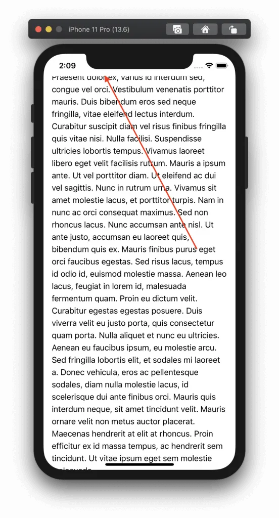
So what's the notch? It's the top of the screen on your new iPhone where Face ID authenticates. Designing around this can be a pain. We cleared out the existing NuxtJS default page and added some Lorem Ipsum content so you can see what we are talking about.
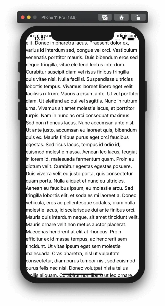
This is obviously a much more dramatic example with the text, but you can see the UX is not good. Now think of this even with a header. You have to account for the padding on the top so your images or logo doesn't bridge into the Notch area. So how do we do that?
Luckily, you can do this through CSS through pre-defined variables present on iOS. With some of the tips that Dragan Error presented in his post, we can convert this to some useful TailwindCSS utility classes. After conversion, include them in our project and voila, the UX starts to come to life! As Dragon mentioned, there are two ways to apply these CSS variables and four different variables .
The two ways to apply these variables are through the constant() and env() helper methods. If you are supporting iOS 11.0 - 11.2 then use constant(), after 11.2 use env(). Or in our case, make a simple tailwind plugin that allows you to easily apply both!
The four variables are as follows:
- safe-area-inset-top
- safe-area-inset-left
- safe-area-inset-right
- safe-area-inset-bottom
These variables will account for screen rotation as well since the notch could be on the right or left side of the screen. They get set when the user rotates the phone and the amount of "safe-area" gets defined.
To solve this in our app, let's make a simple TailwindCSS plugin. First, on top of your tailwind.config.js file add the following so we can create plugins:
const plugin = require('tailwindcss/plugin')
Now, find the plugins array near the bottom of the file. In the array, add the following plugin to add a few utility classes that account for the notch:
plugins: [
    plugin(function({ addUtilities }){
        const newUtilities = {
            '.safe-top' : {
                paddingTop: 'constant(safe-area-inset-top)',
                paddingTop: 'env(safe-area-inset-top)'
            },
            '.safe-left' : {
                paddingLeft: 'constant(safe-area-inset-left)',
                paddingLeft: 'env(safe-area-inset-left)'
            },
            '.safe-right' : {
                paddingRight: 'constant(safe-area-inset-right)',
                paddingRight: 'env(safe-area-inset-right)'
            },
            '.safe-bottom' : {
                paddingBottom: 'constant(safe-area-inset-bottom)',
                paddingBottom: 'env(safe-area-inset-bottom)'
            }
        }

        addUtilities( newUtilities );
    })
],
So what this does is gives us a few utility classes we can apply to our layout that account for the notch. We now have the safe-top, safe-left, safe-right, and safe-bottom utility classes at our disposal! Let's apply them and check out the result.
To apply these classes, we want to account for the entire layout of the app and for every orientation. The best way to do this with NuxtJS is through the layouts which pages inherit from. Right now, we just have a layouts/default.vue file, so let's open that.
In the wrapper apply the following classes:
<template>
  <div class="safe-top safe-left safe-right safe-bottom">
    <Nuxt />
  </div>
</template>
Now when we build our app, the notch has been accounted for on both orientations:
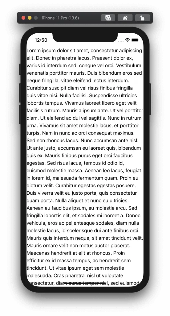
Looks a lot better now! On scroll, the text DOES go behind the notch. There's a few ways to solve this, like adding a header, or doing a view height that overflows when scrolled. Either way works great, and as long as you have the helpful utility classes at your disposal, it should be pretty quick to resolve!
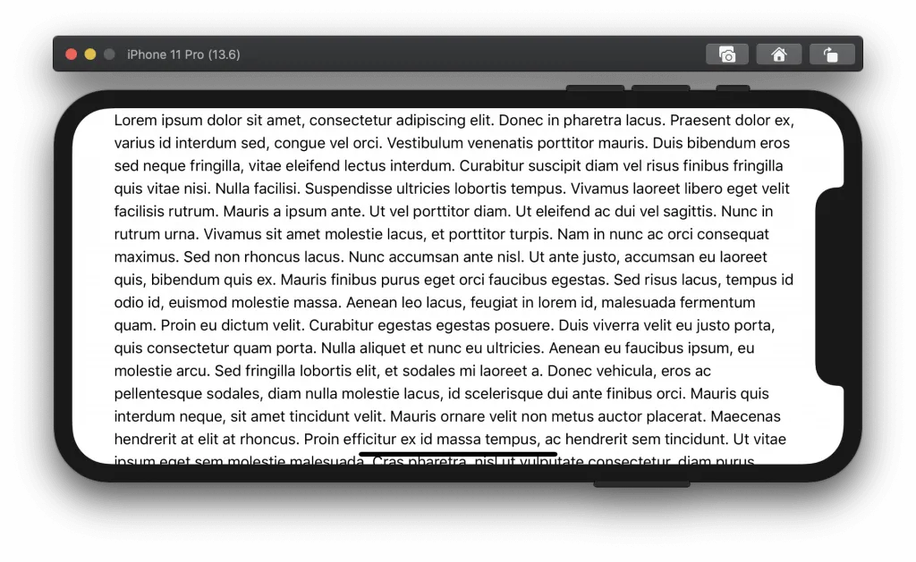
However, the text does run all the way to the left and right on portrait mode. Let's solve that with a little margin.
Proper Margin
My go to margin for each side of the app is 16px. This is the default if you would do AutoLayout when building an iOS app. Now we aren't just focusing on iOS, but this looks wonderful with Android as well.
Doing this with TailwindCSS is a breeze! We just need to add the utility mx-4 to the container. I did this in the same layout as I added the safe- classes. This way it will apply to the entire mobile application:
<template>
  <div class="safe-top safe-left safe-right safe-bottom mx-4">
    <Nuxt />
  </div>
</template>
The result of this change looks like this:
Starting to get there! There are few other utility classes TailwindCSS provides that really help to make developing a mobile app a breeze.
No Outlines!
While you do want to show user interaction on a button, you don't want to outline it. Same with text inputs. That's a very "web browser" type feel not a "native app" type feel. Luckily TailwindCSS provides a wonderful utility class called .outline-none which solves this problem. Applied to an <input> element, the differences look like:
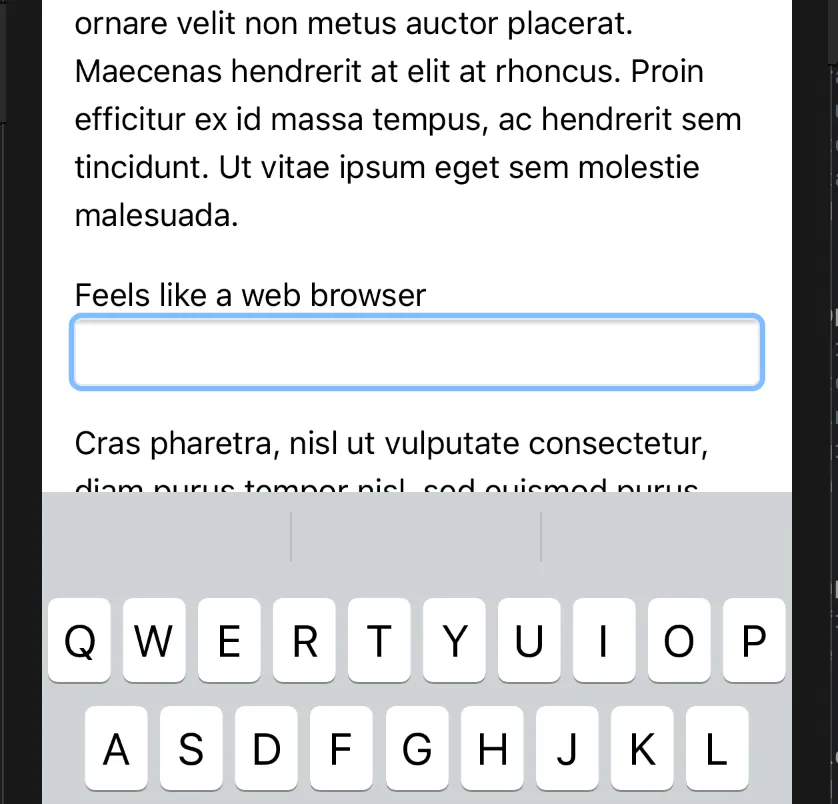
Compared to a more "native app" type feel:
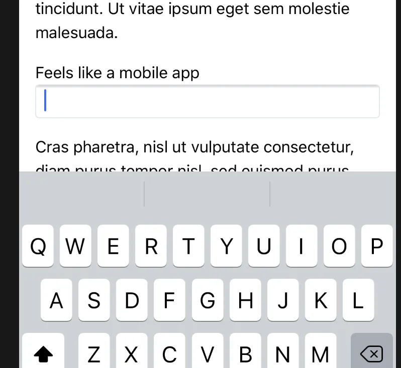
I would highly recommend using this utility class to make your mobile app more "native" feeling!
Screen Height is Your Friend
Using screen height has become much more of a common place in even web development. Essentially it's designing for the height of your screen size and overflowing internal containers instead of the whole app. You know the notch problem, where the text goes up into the safe area we discussed above? This can be resolved using screen height and floated elements.
Let's solve that problem using a wrapper. So if we open our /layouts/defualt.vue file and look at what we have:
<template>
  <div class="safe-top safe-left safe-right safe-bottom mx-4">
    <Nuxt />
  </div>
</template>
Essentially we are wrapping everything with safe padding for the notch and a margin of 16px. This makes for a nice layout, but how do you deal with scrolling? The text goes into the forbidden area next to the notch? To solve this, we use a child wrapper that's set to the height of the screen like this:
<template>
  <div class="safe-top safe-left safe-right safe-bottom mx-4">
    <div class="max-h-screen h-full overflow-y-scroll">
      <Nuxt />
    </div>
  </div>
</template>
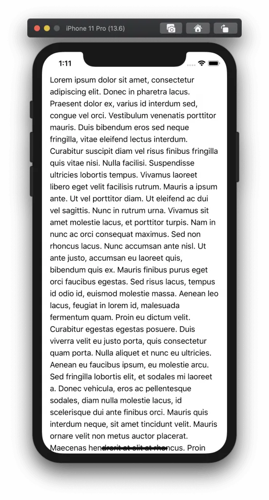
Now, our child element is set to the full available height which accounts for the padding due to the notch. When we scroll, our content does not go into the forbidden area!
When adding either a fixed header, fixed footer or both, we can make this feel extremely native. Speaking of extremely native, because we added an area that we nested inside of our app, we can remove scrollbars in the application that make it feel more "web like" instead of "app like".
Removing Scrollbars
Now that we have our screen height container, we can remove the scrollbars from the application. This makes the app feel SO MUCH MORE app like. To do this, let's add another utility class to TailwindCSS. Open up tailwind.config.js and add the following to your newUtilities object:
'.disable-scrollbars' : {
    scrollbarWidth: 'none',
    '-ms-overflow-style': 'none',
    '&::-webkit-scrollbar' : {
        width: '0px',
        background: 'transparent',
        display: 'none'
    },
    '& *::-webkit-scrollbar' : {
        width: '0px',
        background: 'transparent',
        display: 'none'
    },
    '& *' : {
        scrollbarWidth: 'none',
        '-ms-overflow-style': 'none'
    }
}
Now we have a new .disable-scrollbars utility class we can implement. This will remove the scrollbars on our app.
Next, let's re-open up our layouts/default.vue file and add the class to our child component that handles the overflow:
<template>
  <div class="safe-top safe-left safe-right safe-bottom mx-4">
    <div class="disable-scrollbars max-h-screen h-full overflow-y-scroll">
      <Nuxt />
    </div>
  </div>
</template>
Now when we scroll in our app, we don't have any scrollbars making it feel even more native! The next trick I have is to disable copy and paste on certain elements. Luckily TailwindCSS makes this a breeze.
Disable Copy and Paste (On Certain Elements)
On the web, if you want to copy and paste the text of a button, you can totally do that. However, on mobile it's really weird to have the copy/paste tool tip pop up if you hover too long over a button. We want to disable that.
TailwindCSS allows us to do that with a simple utility class: .select-none. This utility class disables the selection on certain elements so you won't get a pop up if the user hovers too long. I always apply this class to any button, UI images (yea, you can copy and save images), or other input that has text.
Disable Tap Highlight
Finally, we want to disable the tap highlight. What this means is that there's a flash in mobile web browsers when the user taps an input element like a button. Disabling this gives a much more native feel when users click a button. You should have control and highlight as you choose, not through the native webkit implementation.
To disable tap highlighting, we make it invisible. To do this, back to the tailwind.config.js file and add the following utility to our mobile utilities plugin:
'.no-tap-highlighting': {
    'webkit-tap-highlight-color': 'rgba(0,0,0,0)'
}
On any element, we can now add the .no-tap-highlighting class and the tap highlighting will be invisible. Our final "native mobile utility classes" plugin should look like:
plugins: [
    plugin(function({ addUtilities }){
        const newUtilities = {
            '.safe-top' : {
                paddingTop: 'constant(safe-area-inset-top)',
                paddingTop: 'env(safe-area-inset-top)'
            },
            '.safe-left' : {
                paddingLeft: 'constant(safe-area-inset-left)',
                paddingLeft: 'env(safe-area-inset-left)'
            },
            '.safe-right' : {
                paddingRight: 'constant(safe-area-inset-right)',
                paddingRight: 'env(safe-area-inset-right)'
            },
            '.safe-bottom' : {
                paddingBottom: 'constant(safe-area-inset-bottom)',
                paddingBottom: 'env(safe-area-inset-bottom)'
            },
            '.disable-scrollbars' : {
                scrollbarWidth: 'none',
                '-ms-overflow-style': 'none',
                '&::-webkit-scrollbar' : {
                    width: '0px',
                    background: 'transparent',
                    display: 'none'
                },
                '& *::-webkit-scrollbar' : {
                    width: '0px',
                    background: 'transparent',
                    display: 'none'
                },
                '& *' : {
                    scrollbarWidth: 'none',
                    '-ms-overflow-style': 'none'
                }
            },
                '.no-tap-highlighting': {
                'webkit-tap-highlight-color': 'rgba(0,0,0,0)'
            }
        }

        addUtilities( newUtilities );
    })
],
Conclusion
We've gone pretty far with making your NuxtJS install feel more "app-like" using TailwindCSS. Next up, we will look at two smaller enhancements with NuxtJS that will add some more flair!
We've done all of this with the intention of deploying only to mobile, but what if you want to use the same codebase for web and mobile? We have a book that goes through the entire process! Unifying all the commands into one, custom building your own API, using the same codebase for web, iOS and Android, and so much more!
If you have any questions, feel free to reach out on Twitter (@danpastori) or ask a question in the comments section below!
Want to work together?
Professional developers choose Server Side Up to ship quality applications without surrendering control. Explore our tools and resources or work directly with us.

Join our community
We're a community of 3,000+ members help each other level up our development skills.
 Join our Discord
 Platinum Sponsors

Active Discord Members
We help each other through the challenges and share our knowledge when we learn something cool.
Stars on GitHub
Our community is active and growing.
Newsletter Subscribers
We send periodic updates what we're learning and what new tools are available. No spam. No BS.
Sign up for our newsletter
Be the first to know about our latest releases and product updates.
We're a community empowering product builders with self-hosted tools and open source solutions.